The Charts Smart Part helps you to visualize data using a wide variety of chart types. It plots data visually using static or dynamic data sources.
In this tutorial, you will learn how to render a bar chart in generated documents using data from a Repeater smart part.
Overview
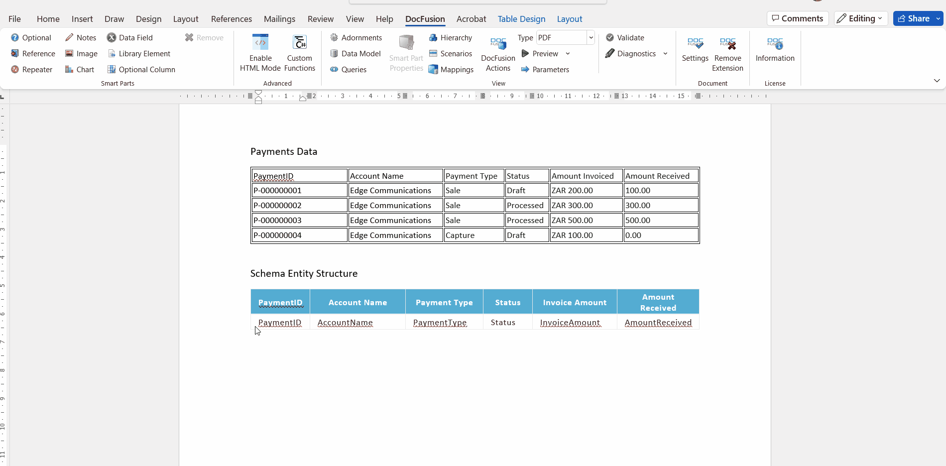
Begin with a dataset containing the values that you visualize using a chart. For this tutorial, we’ll use the list of payments below to render a bar chart. Let’s assume that this data comes from your accounting database, and is being visualized to differentiate between the amounts invoiced to a particular account and how much was actually paid.
Payment List
| Payment ID | Account Name | Payment Type | Status | Amount Invoiced | Amount Received |
|---|---|---|---|---|---|
P-000000001 | Edge Communications | Sale | Draft | ZAR 200.00 | 100.00 |
P-000000002 | Edge Communications | Sale | Processed | ZAR 300.00 | 300.00 |
P-000000003 | Edge Communications | Sale | Processed | ZAR 500.00 | 500.00 |
P-000000004 | Edge Communications | Capture | Draft | ZAR 100.00 | 0.00 |
Step 1: Create a repeatable entity
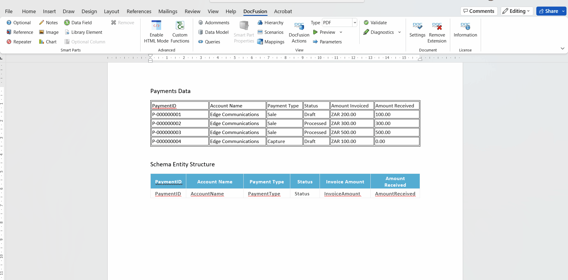
First, capture the structure of the data. Examine the Payments table above. The columns provide a clear indication of the data structure, or entity, that is needed in your template schema. From the data in the rows, you can also glean the data types for the values of each record, as reflected below:
Payments Schema (from Payments Table)
| PaymentID | AccountName | Payment Type | Status | Invoice Amount | Amount Received |
|---|---|---|---|---|---|
Text | Text | Text | Text | Decimal | Decimal |
To complete this task, we will use DocFusion Actions. It is a simple, yet powerful, tool to quickly perform a variety of essential templating tasks. Once you’ve created a new document in Microsoft Word, and have Extended it for dynamic generation with DocFusion, follow these steps:
Create the Repeatable Section
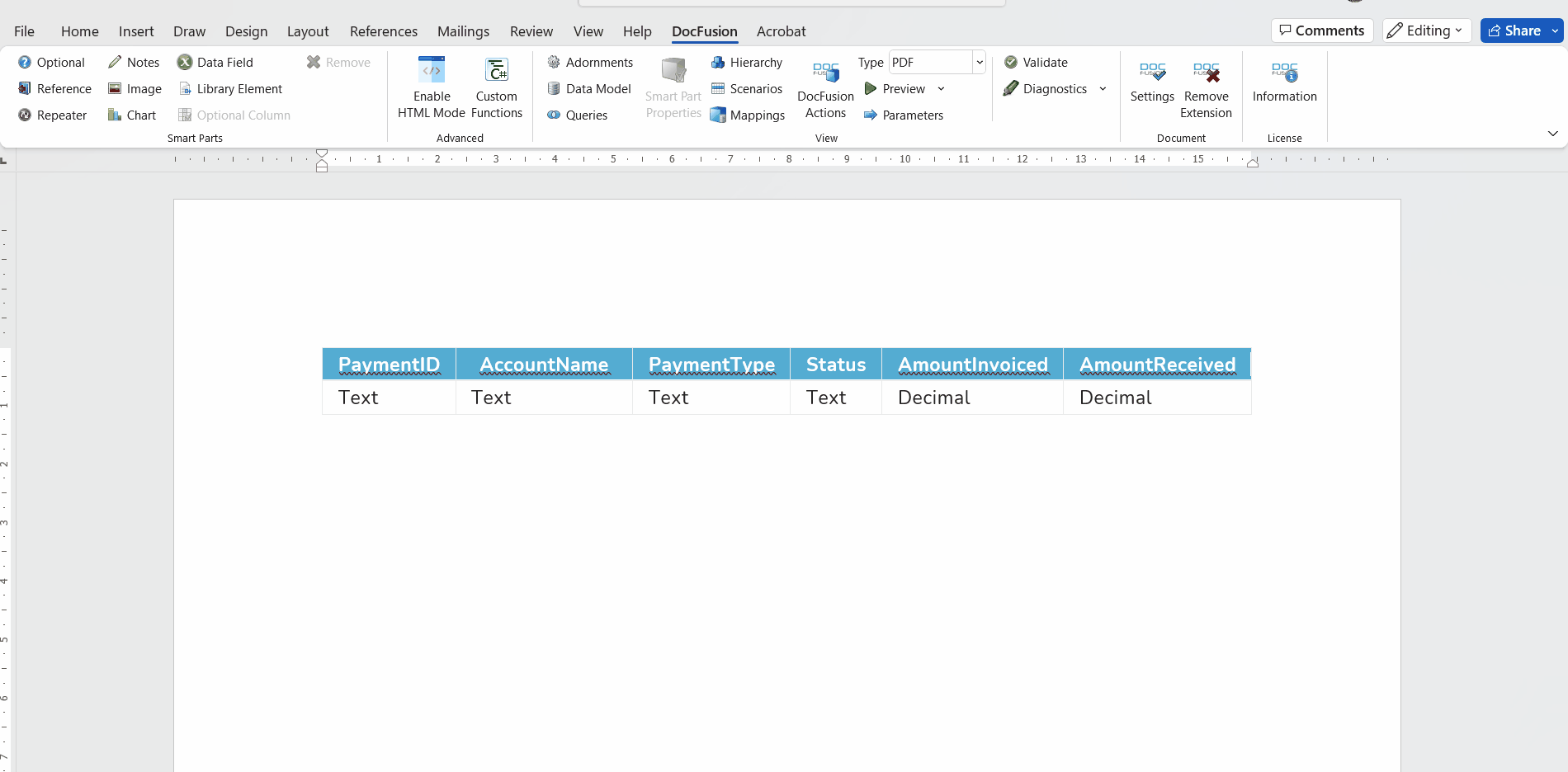
To begin, copy the Payments Table below into your DocFusion template. We’ll use it to create an entity structure in your template’s Data Schema.
| PaymentID | Account Name | Payment Type | Status | Invoice Amount | Amount Received |
|---|---|---|---|---|---|
PaymentID | AccountName | PaymentType | Status | InvoiceAmount | AmountReceived |
Click DocFusion Actions in the View section of the ribbon bar. The tool-pane will open alongside your document canvas.
Now, just below the blue header row, highlight the first row of the table. All columns, from PaymentID through to AmountReceived, should be highlighted. Notice that the list of tools in the DocFusion Actions pane have updated according to your selection. Find the one labelled ‘Create Repeated Section’ and click it. The tool will expand in the Actions Pane to display its configuration options.
DocFusion Actions: Tool descriptions reflect the value of text you have highlighted. This helps to confirm where your Repeated Section will apply.

Configure the Repeatable Section as follows:
- Set the Repeater Title to ‘Payments’. This identifies the Smart-Part.
- Select the New Data Source option for the binding. This instructs DocFusion to create a new entity structure in your template’s Data Schema. Entity structures are also referred to as Data Types.
- Set Parent Type to ‘Schema’, since the entity being created for payments doesn’t have any parent data structure. Schema is the templates default Data Model.
- Now set New Source Name to ‘Payments’. As opposed to naming the Repeater Smart-Part above, this setting names the data entity. By giving each the same name, they become easier to identify as a combination of Smart-Part and the data it represents.
- Lastly, set the New Source Type Name to ‘Payments’ too. This names the Data Type created above and helps you to refer to the collection of fields that make up records of transactional data.
- Click Save.
You’ll notice that a Smart-Part container will now be drawn around the first row of the Payments data table. This indicates that the Repeater Smart-Part was successfully created.
Step 2: Define the data-fields
In the previous step you instructed DocFusion to treat the Payment data as records, or a collection of values. Now, by defining the individual data-fields that make up a record, you’re adding structure in the form of column data. Creating data fields, along with their corresponding data-types, allow you to capture the values to be plotted on the chart. Continue using the DocFusion Actions pane to perform this operation:
Create the data-fields
Within the repeater section you defined, highlight the PaymentID text in the first column of the table. In the DocFusion Actions pane, find the Insert Data Field tool and click it. It inserts a data-field at the cursor position.
Note that the field you create must be positioned within the repeated section since the data fields represent the data you want to repeat as rows of the table.
When the tool expands to display its configuration options, set it up as follows:
- Set the Data Field Title to ‘PaymentID’. Type the name as one word to simplify referring to it during use. This property identifies the Smart-Part.
- Set the Binding to New Input Variable since this is a value from the Payments data that we want to capture. This selection instructs DocFusion to create a new property for the entity that we will select next.
- In the Add to Data Source drop-down, select Payments. This is the entity we created in the previous step using the Repeater Smart-Part.
- Set New Input Variable Name to ‘PaymentID’. This is the field-name in the template’s schema that this data-field will be bound to.
- Lastly, select Text from the Data Type drop-down. This defines the type of data that will be contained in this data-field.
- Click ‘Save’. Notice that a container will now be drawn around the PaymentID Smart-Part within the repeated section.
Now that you have successfully created the first dimension of data to be used in your chart, use the same process as above to capture the remaining data-fields in the Payments table. These are the AccountName, PaymentType, Status, InvoiceAmount and AmountReceived.
As you add each data-field, examine the Payment Data Table once again to identify their data types. Set all of them to the data type Text, except for the AmountInvoiced and AmountReceived. Set their data types to Decimal.
DocFusion Actions detects the data-type for you based on the value of data. Format settings for number data-types become available when selecting Number data types.
Decimal data-fields are numbers, and so have format settings. Ensure their configurations are set as follows:
- Number Format = ‘Format Number’. This specifies that the number should be formatted.
- Number Pattern = ‘#,#.##’. The hashes are placeholders for numbers, while the commas and periods denote the formatting of the number. This is a typical formatting for currency numbers, where units of a thousand are separated by commas and the cents portion of an amount is separated by a period.
- Decimal Places = ‘2’. Since an amount is a currency number, 2 decimal places are required for the cents portion of an amount.
- Thousands Separator = Include. Checking the box ensures that the currency amounts equal to or higher than 1000 will use a comma to separate amount units.
Once you’ve created all the data-fields, let’s verify that the entity structure was created as expected. To do so:
- Click Data Model in the DocFusion ribbon bar. The Data Model Window will open.
- Scan for the Payments entity in the list and twirl it open using the little arrow alongside. You should see the 6 properties, or data-fields, you've just created.
Step 3: Create scenario data
Scenario data specifies the data that will be visualized in the generated chart. Once again, you will use the data in the Payments Table to capture the scenario. Each row of data in the table should be captured to accurately plot your chart.
To capture the first row of data in the Scenario Editor:
Click Scenarios in the ribbon bar. The Scenario Editor window will open.
Click Add Scenario in the toolbar. When prompted, type ‘Scenario 1’ as the name of the scenario, and optionally add a description. Something like ‘Payment comparison’ is appropriate. Click Save. Notice that the Data Model tab is immediately populated with the list of entities and fields in your template’s Data Model.
Find the Payments entity in the list and click it to select. Add a row of data to test this entity by clicking Add Item in the toolbar. An instance of Payments will be added beneath the Payments entity in the list, and twirling it open allows you to edit the values of the individual data-fields in the instance.
Now refer to the first row of the Payments table. Copy the data from each column into the respective fields in the Payments instance you just created. For the first row of data in the Payments table, these are the values to enter in the Scenario Editor:
- ‘P-000000001’ is to be copied to the PaymentID field value
- Then, ‘Edge Communications’ for the AccountName value
- ‘Sale’ is the Payment Type value
- ‘Draft’ as the Status value
- Set InvoiceAmount to 200.00. Notice that no currency symbol is accepted since this is a decimal value.
- And lastly, set AmountReceived to 100.00. Again, decimal values do not accept a currency symbol.
You’ve now captured the first row of data from the Payments table into the Scenario Editor. Use the same procedure to continue entering the values for the remaining rows of data in the Payments table, first by creating a Payments entity instance and then entering its values.
When you’re done, click Save on the Scenario Editor to return to the document canvas.
Step 4: Create your chart
You now have the entity structure and data to create your chart.
Place your cursor on an empty line in the document canvas and click the Chart Smart-Part in the DocFusion ribbon bar. Microsoft Excel will open with sample data to render a rudimentary chart, but you need not use this. Simply close the window without saving to dismiss Microsoft Excel. A sample chart will be drawn for you on your document canvas.
Configure you chart
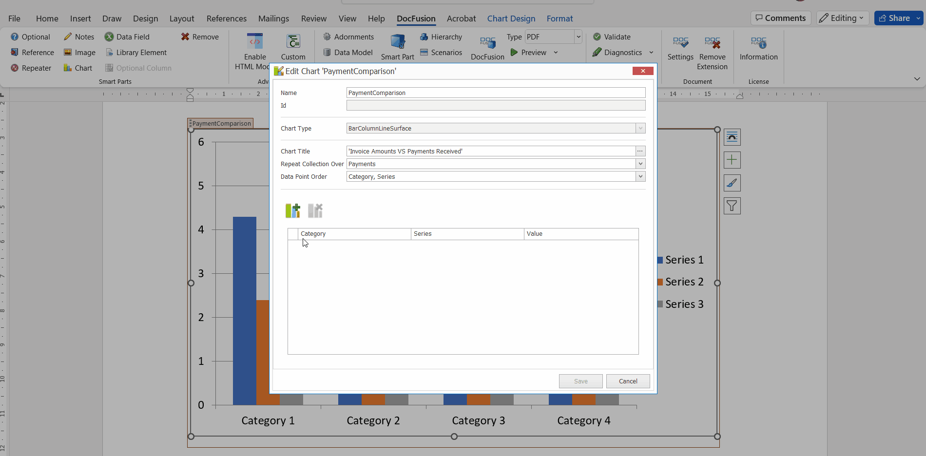
Click the chart in the document canvas to select it, and then click Smart-Part Properties in the ribbon bar. The Chart configuration window will open.
Set the charting configuration as follows:
- Name = ‘PaymentsComparison’. This setting names the chart Smart-Part for easy referencing.
- The ID property is disabled by default. This is because DocFusion will assign a unique identifier for this Smart-Part once you configure it.
- Chart Type is also a disabled property. DocFusion acquires this setting from Microsoft Word. If you want to change the type of chart being rendered in your template, you can do so using the chart options in Microsoft Word. DocFusion will retain all other settings as to the values being plotted, the series of values and so on.
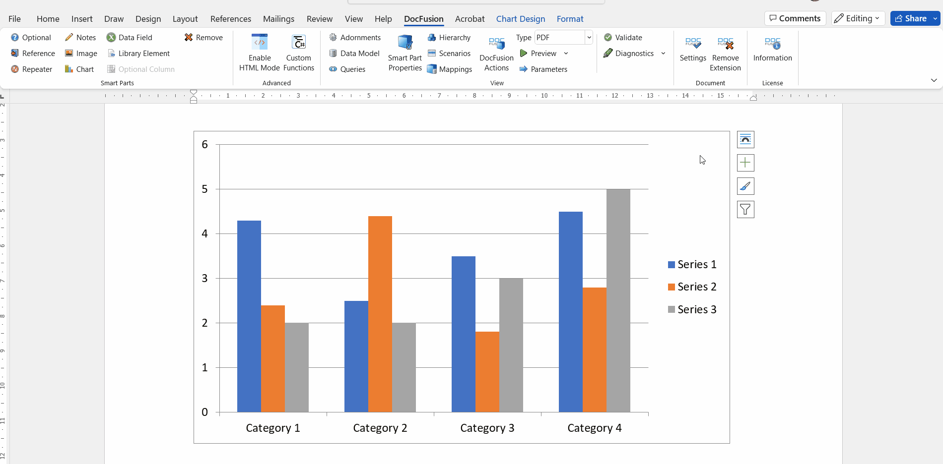
- Set Chart Title to “Invoice Amounts VS Payments Received”. This setting labels your chart. It can also be set to a dynamic value. In this exercise, however, we will set it as a static value. To do so, click the ellipses alongside the Chart Title field and select Constants from the configuration window. Type the text value above into the editor provided and click Save. You will be returned to the Smart-Part Properties window.
- Set Repeat Collection Over to ‘Payments’. This is the name of the Repeater entity you created in Step 1. Selecting it now instructs DocFusion where to find the data for your chart.
- The Data Point Order setting allows you to visualize the same data in alternate ways. Set it to ‘Category, Series’. This means that the chart will be organized by categories on the X-axis and the series of data plotted across those categories on the Y-axis.
Your chart is now configured. In the next step we will plot the data.
Step 5: Plot the data for your chart
The datapoints to plot your chart are defined in the table below the chart configuration settings in the Smart-Part Properties window. Thus far, we haven’t defined any datapoints. That’s what will be accomplished in this step.
To plot the Payments data onto your chart:
Ensure that you are working in the Smart Part properties window. If it isn’t open, click your chart in the document canvas, and then click Smart-Part Properties in the ribbon bar.
Once the properties window opens, locate the Add DataPoint tool in the toolbar below the chart configuration. This is where you configure categories, series and values for your Docfusion charts. Click Add DataPoint. A row will be added to the datapoints table.
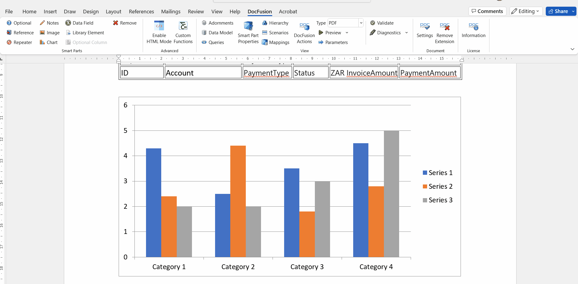
We’ll first configure the Category, which classifies the datapoints along the X-Axis of the chart. In this exercise, the purpose of the chart is to distinguish between the amounts invoiced to an account and the payments received. Since payments in the Payments table are categorized by their statuses, this is a useful way to visualize the data. To set Status as a categorization:
- Click the ellipses in the Categories field of the datapoint you just created. The configuration will open to help you select the dynamic bindings to the data. By default you will be directed to the Data Source tab. If not, click it.
- The first drop-down, labelled Show Bindings, allows you to select data-sources from your template’s schema. It’s useful when rendering more advanced charts, however the default binding will suffice for the payments chart that we are creating. Leave the first dropdown’s setting at ‘@{modelName}’.
- In the next dropdown, select [@Payments][.Status]. This creates categories along the X-axis of your chart using the Status data in the Payments table, viz: whether a payment is in draft stage, processed, etc.
- Click Save to return to the Chart Properties window.
Next, configure the values to be plotted along the Y-Axis:
- Click the ellipses in the Values column of the datapoint row. Again, the configuration window opens to select the Data Source. The Show Bindings dropdown can be left at its default setting as before, then from the second dropdown select [@Payments][.InvoiceAmount].
- Click Save to return to the chart properties.
Lastly, identify the datapoints being plotted as a series:
- In the Series column, click the ellipses. When the configuration window opens, select the Constant tab and type in ‘Invoiced’ into the editor provided.
- Click Save to return to the chart configuration.
You could also use data from a dynamic data source to define a series label. Simply select the Data Source tab in the configuration window, and configure the bindings to suit your needs.
What we’ve just accomplished is plotting the Invoiced Amounts data on the chart. However, the purpose of the chart is to compare Invoiced Amounts to Payments Received so we need to also plot a second series of datapoints showing the paid amounts.
The process of adding Payment Amount datapoints is the same as above:
- Create a new row in the datapoints table on the chart configuration screen.
- Configure the category to [@Payments][.Status] again as plotting the payment amounts alongside the invoiced amounts allows us to make comparisons between the data on the chart.
- For the Values to be plotted along the Y-Axis, configure the data source to bind to [@Payments][.PaymentAmount].
- And lastly, label the series using the Constant: ‘Received’.
- Click Save in the chart properties window to return to your document canvas.
It’s time to preview the chart and verify that it has been rendered correctly.
Step 6: Preview the chart
Since we’ve already provided the data to test our chart when creating a scenario in Step 3 above, all that you need to do is click Preview in the DocFusion ribbon bar.
If you have created alternate scenarios containing a different dataset to test your chart with, click the dropdown alongside the Preview button to select your scenario. The chart we’ve just created will be tested using that data. This feature is useful to test different business cases.
Review
To summarize this tutorial:
- Drawing charts in DocFusion requires that you map the values and categories of data to fields in your data source.
- This places importance on the repeatable entities that you define for your chart in the Data Schema.
- There are several ways of creating entities, so choose a method that suits your needs.
- With your data structure in place, Microsoft Word charting options can be used to customize the style and other properties of your chart to arrive at the visual representation that you want.
Additional Resources
- Learn more about Data Schema’s and creating a data model for your document template
- How to use scenarios to test your template for a specific business case
- The Repeater Smart-Part type
- Change the type of chart to render using Microsoft Word’s charting options
- Access advanced charts and styling using the Chart.js feature
- Download the Tutorial Sample Template