The Chart Smart Part honours any Microsoft Word settings that you apply to it, including chart-types, styles and colours. These tweaks allow you to customize the visualization of data in generated documents. Find instructions to do so in this guide.
Learn how to use the Chart Smart Part using this tutorial...

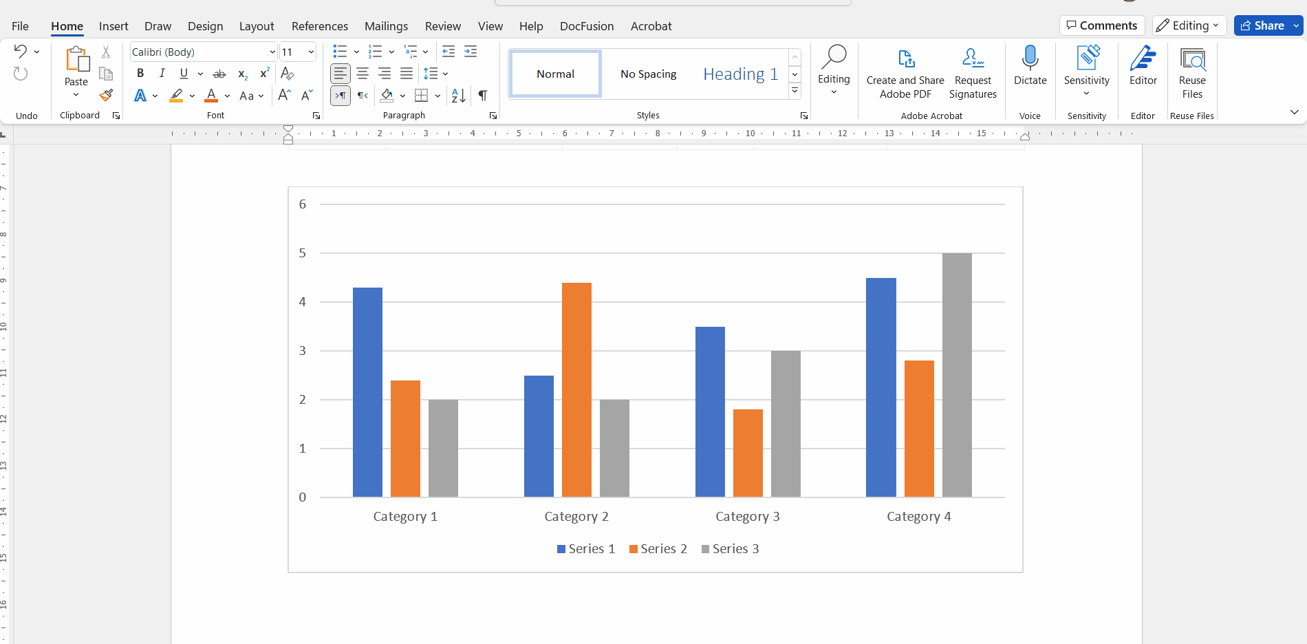
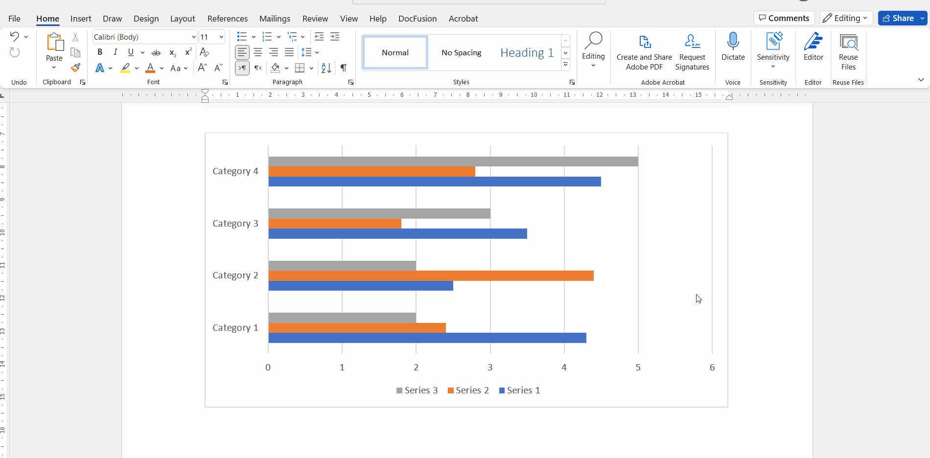
Changing the chart type
The chart-type setting allows you to visualize the same dataset in different ways, e.g. as a bar, pie or radar chart.
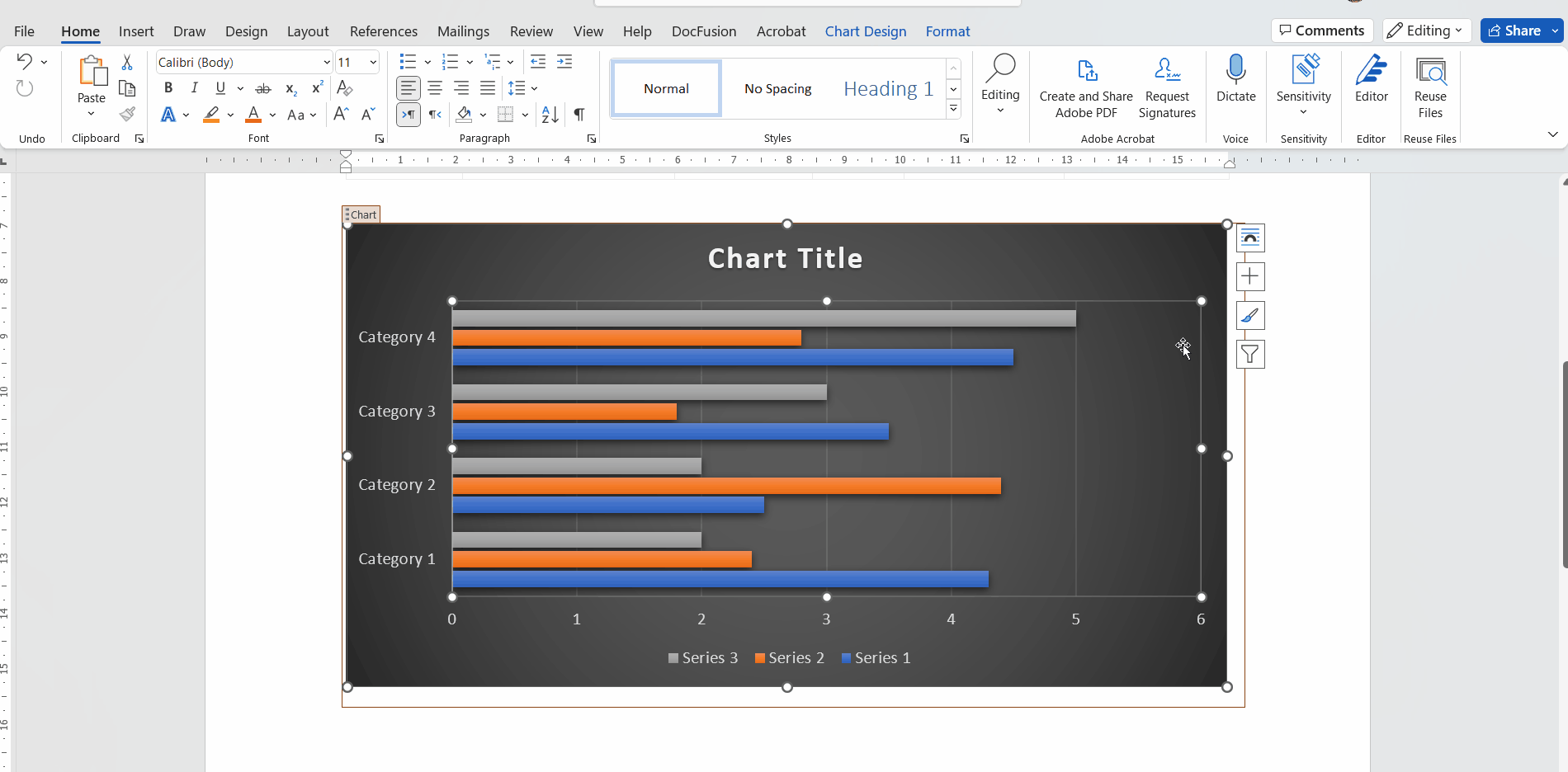
Once you have your DocFusion template opened, navigate to the Chart smart part that you want to customize and select it. This activates the Chart Design option in Microsoft Word's menu-bar. Navigate there to access the ribbon bar which contains a variety of charting options.
Click the option: Change Chart Type. The Chart Types dialogue opens.
Now choose the type of chart that you want to render by either selecting it directly or filtering the list of charts using the categories list on the left.
Click OK to return to the document canvas. Notice that the chart changes to reflect your type selection.
Now click Preview in the DocFusion ribbon bar to generate a document from your template and preview your chart.
Changing the chart style
Chart styles let you alter the appearance of a chart by configuring its visual style and colour.
To change a chart's style, select the Chart smart part that you want to customize. Notice the hover-menu that appears alongside. One of the options in that list is Chart Style. Click it to view the list of available styles and colours.
Now, navigate to the Style option you want and click to apply it. Notice that the chart in your document template changes to reflect your selection. Click away to return to the document canvas.
Now click Preview in the DocFusion ribbon bar to generate your document and preview the chart.
Changing chart colours
Tweaking chart colours applies a different colour scheme but retains the chart style.
Select the Chart smart part that you want to customize. The hover-menu appears alongside, with the option to adjust Chart Styles.
Select the Chart Styles option, then navigate to the Colour tab. Colours are organized in palettes of swatches. Selecting one applies it to your chart. Click away to return to the document canvas.
Now click Preview in the DocFusion ribbon bar to generate the document and preview your chart.
Additional Resources
- Creating advanced charts using Chart.JS
- Adding Chart.JS plugins
- Tutorial: Visualize payments using a bar chart.